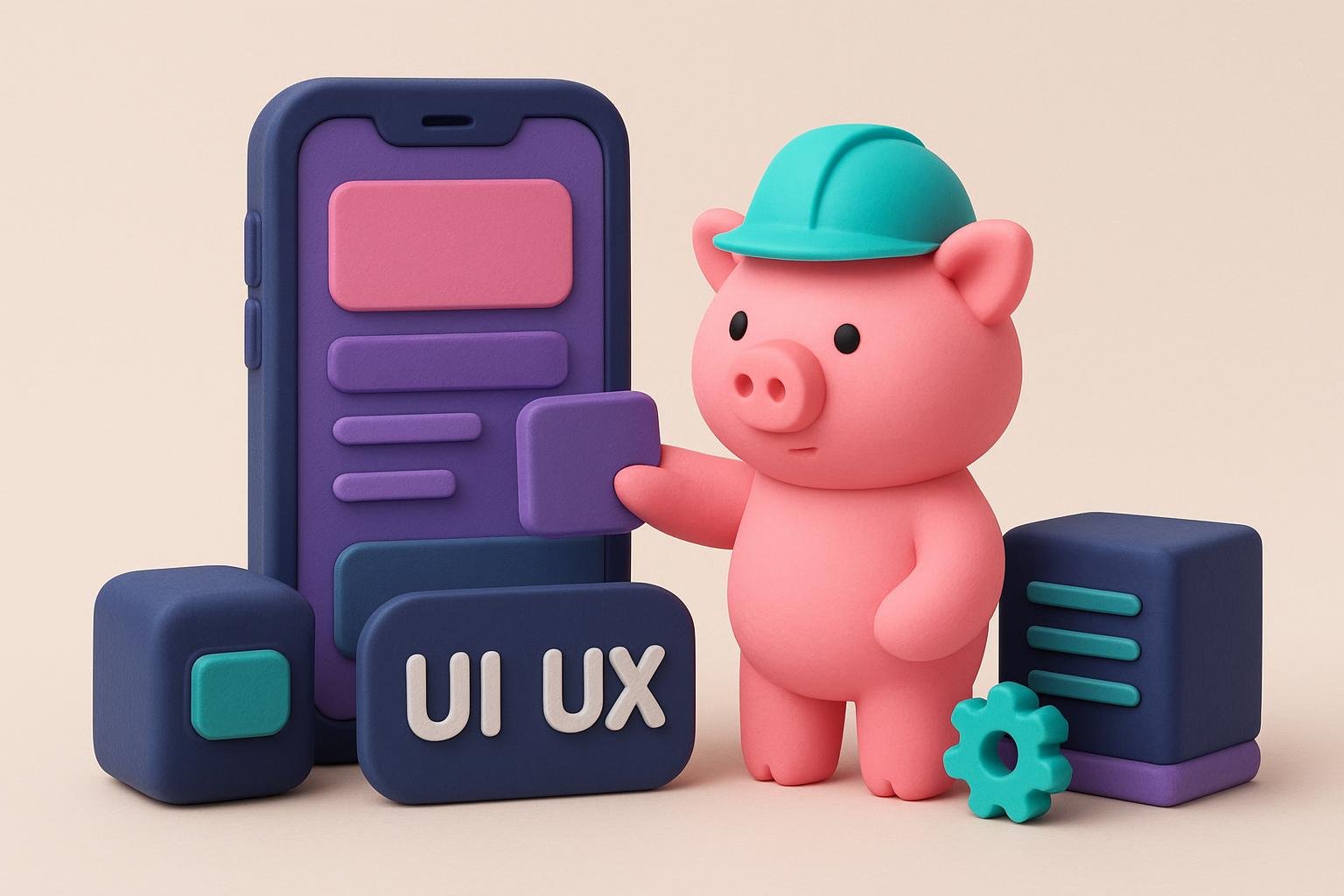
App design can be divided into two parts: UI and UX. You should clearly understand the difference: UI (User Interface) is the look of specific elements, such as button sizes, fonts, colors, shapes, etc.
UX (User Experience) is the user's overall impression of a product during and after interacting with the app. Look at the most successful apps—they solve our problems, are easy to use, and look great at the same time. That's what you should aim for: your app should combine excellent UX and UI without losing sight of the purpose it was created for. Put simply, when creating a product with beautiful design, you mustn't forget about its users and their needs. Before release, it's worth checking your project for common UX design mistakes. Our checklist will help.
1. A bad first impression
This is probably the biggest mistake of all. After all, if users don't enjoy interacting with your product the first time, they're unlikely to want to do it again. You may not even get a second chance—the market is packed with your competitors. Creating an app that's intuitive and quickly introduces users to its most interesting features is a delicate balance, and it's crucial to the project's success.
2. Apps without a purpose
Take another look at those impressive app deletion stats and think about it. You should always remember why you're creating the app and what user problem it solves. A well-designed interface should help users reach their goal as quickly as possible, with as few taps as possible. Users should understand your idea the first time they interact with it. Otherwise, they'll probably become one of the three who don't make it to the 30-day mark.
3. Inclusive design
A common mistake, especially with apps used by large numbers of people, is forgetting about inclusive design. An app's design should be accessible to every user, regardless of age or ability.
4. Not knowing your user
Before you start developing your app, you need to get to know your user. You can't design an interface for yourself, convinced that “I'm part of the target audience too.” That's because when we design an interface, we're solving several problems at once. So it's important to think not only from a business perspective, but also like an ordinary user—the person this product is made for.
5. Ignoring the budget
It's important to plan your budget before you start development. This will save you from wasting time developing UX mockups that you ultimately won't implement if your team doesn't have the resources for them.
6. Overusing push notifications
Push notifications are micro-interactions between the user and your app. On the one hand, they're a real boon. You can send users information and ads they need, and there's a better chance they'll read them than an email blast. But there are risks too: the frequency and content of messages matter. Reminders, system updates, and new features, for example, are useful notifications.
Boring, frequent, intrusive content and aggressive marketing will probably annoy users and make them turn off notifications. That means you won't be able to tell them something important when you need to. So always make considered decisions and put yourself in the user's shoes—will this notification benefit them?
7. An overly complicated app design
Navigation problems, reward blocks, and excessive content can be confusing. Users come to you to solve their problem, not to admire every design trend. Keeping things simple is one of the hardest things to do.
8. Android and Apple aren't the same thing
There's a misconception that an interface for one platform can easily be adapted to another. That's not quite true. Sure, users should recognize the elements and the overall concept on any platform, but there are nuances.
9. Ignoring the app's UX structure
A common UX mistake is giving the app's aesthetics far more importance than its structure. If you put beauty ahead of logic or navigation, you'll get a beautiful product nobody wants to use because it's inconvenient. Draw up a detailed app flow before worrying about font size or color scheme.
10. Overusing animation
Animation is a great way to make it easier for users to get to know a product and to bring interactions to life. Unfortunately, using too much animation harms the user experience—it simply gets annoying when it's pouring out of every crack at the user. Designers should pay attention to micro-animations in interface elements. The human eye barely notices them, but they affect how the interface is perceived overall and help users understand that the system is responding to their actions.
11. Unclear UX priorities
Decide which user interface elements you want to highlight, and make them more noticeable than the others. This will help users navigate your app easily and take the actions you want them to take.
12. Overemphasizing features and functionality
We're all pretty tired of having too much of everything—apps in the marketplace, promotional emails, content. We all wish we could just download an app and do what we downloaded it for. No confusion, no convoluted mazes of features. Complicated UI and UX are among the main reasons people delete apps. It's important to think about the user interface not as a developer, but as a user.
Try to find the fine line between user needs and the number of possible app features, and don't cross it. To understand which features users need, you need a clear vision and understanding of the product's ultimate goal. Combining key features this way will make the app easier to use, improve the user experience, and give your app a significant advantage over competitors.
13. Too much text
Let's be honest: we don't download apps for their content. Unless we're talking about a book-reading app. Content is a nice bonus, an opportunity (not an essential solution) for users to learn something useful related to what they're using your app for. So don't overdo it: too much text on one screen is unpleasant and unappealing. But if it's balanced with the right spacing and images, that's a different—and much more pleasant—story. Text should make the app appealing, not drive people away with its presence.
14. Ignoring user feedback
Users are the ones who decide your app's fate. And you absolutely need to listen to them. After all, they're the ones you're creating the app for. If you ignore feedback gathered during beta testing and while the app is in use, if you don't understand users' pain points and aren't willing to fix the flaws, be prepared for your product to be quickly replaced.
App development is a complex and time-consuming process. We hope this list will help your product succeed and save you the cost of fixing mistakes. It's always better not to make mistakes than to spend time and budget fixing them later.