Just take a look at your daily activities, and you'll see that you use a range of physical toggles, such as light switches and kettles. How can a UI and UX designer implement these switches in their design? Let's read on and find out.
When should you use a toggle?
Toggles are best used to change the state of system functions and preferences. If you want to meet users' needs when they change or update preferences and settings, your design should include a toggle. However, toggle design can be a little confusing because toggles have a very specific use, much like checkboxes or radio buttons.
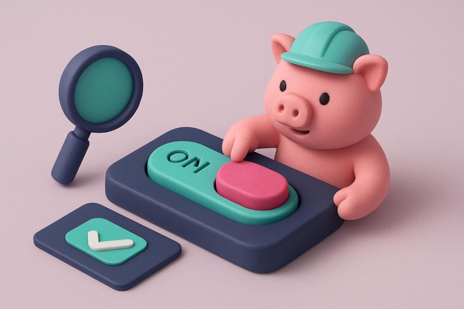
When deciding when to use a toggle in your design, just keep these two rules in mind: use a toggle when an immediate response is required without checking or confirmation; and when a setting needs to turn a feature on/off or show/hide it.
But how do you design a toggle that fits your use case? Take a look at the following guidelines.
Guidelines for designing toggles
1. A toggle should take effect immediately
As we mentioned earlier, toggle design has its roots in real life. Take a light switch as an example and think about how it works. You press the button to turn the light on, and press it again to turn it off.
In UI/UX design, a toggle simply mimics a real-life switch, making it easy for users to understand and use. In other words, when users interact with toggles, they don't need to click “Save” or “Confirm” to apply the new state. Instead, when a user clicks the switch, the selected option takes effect immediately, changing the state of system functions and settings. If immediate results aren't possible because of system delays, you can consider adding a processing-state animation to let users know their toggle is being applied. But remember: the operation should take no more than a few seconds.
2. Don't forget to write good labels
When we encounter a toggle with good labels, it's easier to understand what setting the toggle controls and what state it's currently in. When writing labels, make sure they're short and clear. Use no more than two words, while still clearly describing what the toggles do. It's also better to use an inline, left-aligned label, because these work best with the way users scan a layout. Just remember that toggles are either OFF or ON, and you shouldn't add extra text labels that clutter your interface.
3. Keep your design's appearance consistent
It's common knowledge that the appearance of a UI element helps users predict what will happen when they interact with it. If your design doesn't match what users already know, they'll have to stop and think about how to interact with the UI. When creating your design, make sure the visual language you've chosen for toggles is used consistently, and that all toggles in your app follow this style.
Moreover, don't forget to follow the platform's standard visual design. When your toggle style matches the platform's design standards, people who are familiar with the platform can easily make sense of the UI.
4. Choose the right tool for designing a toggle
Designing toggles is easier than you might think, because many design tools offer toggles among their basic components. But most of them are missing something important: built-in interactions. That's why Mockplus fills this gap and offers designers toggles that are fully functional right out of the box. Designers don't need to upload an image and then add an interaction; all they have to do is drag the switch onto the artboard, and that's it! It may seem like a minor detail at first, but it makes a huge difference to the time and effort required to prototype a product as a whole—especially large products with lots of small UI components.
5. Make your toggle mobile-friendly
If you're a UI/UX designer, make sure your mobile toggles are easy to use.
To do this, make sure the overall layout allows for two things: users can tap the toggle without any trouble, and there's enough space between components for the interface to “breathe.” If you use a design tool like Mockplus, you can choose Android and iOS toggles to suit your design needs, which can really help improve the user experience of your mobile design.
6. Test your toggle design
Last but not least, you need to conduct user testing before publishing your design to make sure there are no system failures. Just remember to check usability standards for both the overall UI design and the specific toggle components. The most practical and effective way to test your toggle design is the good old A/B test. When it comes to toggle design, you need to test the visual hierarchy across the whole page as well as on the specific component. Also, don't be afraid to change the labels until you find one users can understand right away.